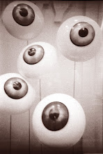
Bethmale is the latest release from Paris based Australian group Heligoland. They asked me if I would be interested in coming up with a sleeve design for an EP which had been recorded while the band went away for a weekend break together.
Showing posts with label Music. Show all posts
Wednesday, 18 January 2012
Wednesday, 30 November 2011
F&F at the British Library
Just had word from F&F towers that the British Library have requested some copies of their releases for its archive. This is probably an everyday thing that happens automatically but it's really nice to know that a copy of the designs done by Pika Pika and those I have done myself will be kept for posterity, as well as some great music! If you fancy some for yourself then there are a few left at the F&F, shop pop over and get your self a pre Christmas treat!
Tuesday, 18 October 2011
Stone Roses to reform?
At the moment all ears are open to hear if The Stone Roses will reform for a series of shows and a possible album. Now I know the nostalgia pull is immense not only for people of a certain age but for those that are discovering the band now who have become somewhat mythologised. But for me it's not so much the live shows but what a new Stone Roses album cover would look like.
As I previously professed in a former post about the Stone Roses I was a big fan not only of their music and attitude but of their sleeves and the art work created by John Squire. They were a complete package. Well I think it doesn't take a genius to work out that if the Roses do reform it will be Cap'n Squire creating the album artwork. From looking at his last exhibition and his latest paintings a new Stone Roses album cover may have an eastern feel, I hope they still do the limited postcard or print with the vinyl singles! To see more of Mr Squires' work head over to his website.
Anyway only time will tell so I'll keep my long sleeve paint splashed top and Wrangler Bell bottoms (21 inch!!) in the wardrobe for the moment and wait to see if a reunion is on the cards maybe the world has moved on but I'll always remember this moment on BBC2…
As I previously professed in a former post about the Stone Roses I was a big fan not only of their music and attitude but of their sleeves and the art work created by John Squire. They were a complete package. Well I think it doesn't take a genius to work out that if the Roses do reform it will be Cap'n Squire creating the album artwork. From looking at his last exhibition and his latest paintings a new Stone Roses album cover may have an eastern feel, I hope they still do the limited postcard or print with the vinyl singles! To see more of Mr Squires' work head over to his website.
Anyway only time will tell so I'll keep my long sleeve paint splashed top and Wrangler Bell bottoms (21 inch!!) in the wardrobe for the moment and wait to see if a reunion is on the cards maybe the world has moved on but I'll always remember this moment on BBC2…
Wednesday, 3 August 2011
Penguin Cinema
If your not festival-ed out already and have room to squeeze another in this year then I recommend the Green Man Festival which features our friends from the north; Arctic Circle who will be putting on a weekend of cinema and sound and creating an island of calm to rest and relax from the rest of the festival's shenanigans with artists such as Emily Barker, NSRO and Paper Cinema!
I created a paper cut illustration for the occasion which I'm lead to believe will be projected in the cinema tent. For more information pop over to the AC website, and if that wasn't incentive enough The Sleeping Years will be playing on Sunday, so don't put the tent away just yet!
Thursday, 21 July 2011
Bear Mix
Apologies for the lack of posts around here recently, just been relocating from France to Ireland for the summer.
It's been a while since I posted any of my own work but here is the latest record sleeve I've been working on. It is the next release from Manchester's Front & Follow label by Washington based artists BLK wBEAR who have reinterpreted a selection of tracks from Yonokierio's album Blue Apples.
The sleeve illustration is a photo of a selection of ceramic sculptures created by Robin VanValkenburgh under the pseudonym of Runny Bunny. With such a striking image I wanted to make the most of the groups name so I started playing about with the symmetry of the words BLK and BEAR and bent some Helvetica Light into shape to create the typeface. It felt a shame to just stick it in the corner so I decided to place it full size over the image.
It will be release as a limited CD with a free digital and specially commissioned video download on 5 September and as always you can get it from the F&F shop where you can hear a soundcloud sample there now.
It's been a while since I posted any of my own work but here is the latest record sleeve I've been working on. It is the next release from Manchester's Front & Follow label by Washington based artists BLK wBEAR who have reinterpreted a selection of tracks from Yonokierio's album Blue Apples.
The sleeve illustration is a photo of a selection of ceramic sculptures created by Robin VanValkenburgh under the pseudonym of Runny Bunny. With such a striking image I wanted to make the most of the groups name so I started playing about with the symmetry of the words BLK and BEAR and bent some Helvetica Light into shape to create the typeface. It felt a shame to just stick it in the corner so I decided to place it full size over the image.
It will be release as a limited CD with a free digital and specially commissioned video download on 5 September and as always you can get it from the F&F shop where you can hear a soundcloud sample there now.
Monday, 4 July 2011
Bjork Crystaline
Some more fantastic work from M/M Paris for the latest release from Bjork. Just pop over to her website to see a new way of browsing, again the design is by M/M Paris aided by the technically astounding Jam3. The new logo is beautiful, refined and works perfectly with the imagery, part note, part eye, part planet! It's a bit hard to pin down like Bjork herself.
If that wasn't enough the Icelandic songstress has also invented a new instrument called the Gameleste which features in her show Biophilia which is currently at the Manchester International Festival, (as is Damon Albarn's Opera Dr Dee), anyway here is a video of the Gameleste being made.
The Gameleste - a custom instrument for Björk from Andy McCreeth on Vimeo.
If that wasn't enough the Icelandic songstress has also invented a new instrument called the Gameleste which features in her show Biophilia which is currently at the Manchester International Festival, (as is Damon Albarn's Opera Dr Dee), anyway here is a video of the Gameleste being made.
The Gameleste - a custom instrument for Björk from Andy McCreeth on Vimeo.
Gummy Lips
I love new and innovative music packaging; stick a badge or poster in a release and I have to buy it, even though I know I have exactly the same record already! Well I was just over at the Flaming Lips site and discovered that their latest release is a USB stick that contains 4 new songs. The USB stick is encased in a jelly edible skull and is a very limited release! I've heard it rumored that this is the first in a series of monthly release from The Flaming Lips so it will be interesting to see if all the tracks will be gummy body parts! This release is $150 a little bit more than my pocket money can stretch to!
Anyone know who the design is by?
![]() |
| Nice use of Futura Black Plain for the text |
Wednesday, 29 June 2011
Richard Hawley's family tree
Just came across this 'rock' family tree on Richard Hawley's site. It's had me occupied for the past hour just tracing the lines back and forward between the various groups. I must read my liner notes more!
Tuesday, 17 May 2011
Birch Book: The fox and the tree
Last week I got my hands on a copy of the latest release from Paris based label Les Disques du 7eme Ciel and took a few photographs of the EP.The release is a 6 track 10" vinyl by Birch Book and is housed in a recycled board gatefold sleeve complete with a version of the EP on CD, a woven patch and two art prints. As always I was given free reign on how the release should look, the only limitations being that it would be one colour printed on a recycled board and that the artist liked it!
I had been trying out a new illustration style for a while and felt that this release was a perfect partner for that style. The illustration style draws on Irish Celtic illustrations as well as Inuit folk art with a touch of psychedelia.
![]() |
| A sketchbook doodle of a bird with something of a fish about him |
![]() |
| From the same sketchbook a detail from a drawing of a hare |
![]() |
| …and from a few pages later my first go at drawing the fox |
With this bubbling around in the back of my mind I started to doing the fox drawing.
I wanted a sense of balance between the animal and vegetable and to include something of the tree within the fox and vice versa. This lead me to here…
and to here.
![]() |
| back cover of 10" vinyl |
![]() |
| Front cover of CD version |
![]() |
| Back cover of CD version |
![]() |
| Side B vinyl label |
![]() |
| Fox print detail |
![]() |
| Tree ring print detail |
Thursday, 12 May 2011
Another Summer
I just finished doing a paper cut illustration for Paris based record label Les Disques du 7eme Ciel to grace the cover of their latest release. Each summer the label puts on a series of small, intimate acoustic concerts which take place on a balcony over looking the Sacré-Coeur. To celebrate the last season of concerts, the label has put together a compilation of rare tracks, album outtakes and demos from the artists who performed. The album contains 18 fantastic tracks from the likes of Josh T. Pearson, The Reject Cards and The Daredevil Christopher Wright. I would strongly recommend popping over there and downloading it and as a bonus you can even download a PDF to print out and create your own CD, including a CD onbody design by yours truely!
If your interested then click here and did I mention it was FREE?!
![]() |
| An initial trial on white paper to see how things work. |
![]() |
| A slightly elevated view showing the concertina fold |
![]() |
| A different colour variation |
Wednesday, 11 May 2011
Sufjan Stevens-L'Olympia 09-05-2011
I had the chance to go and see Sufjan Stevens on Monday night and boy what an experience! If the music wasn't great enough there are the magical animations by NYC artist Deborah Johnson. If you get a chance to go see him (and his amazing band) do not think about it just go!
This isn't a music blog and I'm not a concert reviewer and as Sufjan says himself "words are futile devices" so I'll just post some abstract neon photos, one of the beautiful animations by Deborah Johnston used for Seven Swans and a clip from the concert (watch out for the Casio solo at the end)!
"Seven Swans" live visual content from Deborah Johnson, CandyStations on Vimeo.
This isn't a music blog and I'm not a concert reviewer and as Sufjan says himself "words are futile devices" so I'll just post some abstract neon photos, one of the beautiful animations by Deborah Johnston used for Seven Swans and a clip from the concert (watch out for the Casio solo at the end)!
"Seven Swans" live visual content from Deborah Johnson, CandyStations on Vimeo.
Monday, 2 May 2011
The Doomed Bird of Providence sleeve pics
Just got my copy of The Dead Bird of Providence album in the post and thought I'd put up a few pics of the final package. If you like it then snap it up quick at the F&F shop as it is limited to 250 copies and judging by the press reviews those will sell out fast!

Wednesday, 27 April 2011
Fool's Gold
Apologies for the silence I'm just back again from a couple of weeks in the North of Ireland and spent my time shared between working and taking family friends on the tourist route. This involved crossing the Carrick-a-reed rope bridge, walking around Mussenden Temple at Downhill, walking the city walls up around Derry as well as going back to The Giant's Causeway.
It was while visiting the Giant's causeway and sitting down on the stones and watching the black blue waves rolling in over the stones that I was reminded of all things the album cover for the The Stone Roses debut album ( forgive me, I know the last time I was back it was Led Zep's Houses of the Holy!)
History has it that while doing a gig at Coleraine University The band took a trip up to see the Causeway. Guitarist John Squire was so struck by the colour of the water and rocks that he kept them in mind for a painting that was later used as the cover image for their debut album. The painting was called "Bye, Bye Badman" and is essentially the Causeway inspired image with lemon slices. The lemon slices were added to the composition later based on a story that Ian Brown had heard from a Parisian about how during the 1968 riots; protesters at the time used lemons as an antidote to the tear gas.
At the time that album was such a revelation! I remember taking my copy to friends houses and sitting in amazement, it affected the way that I dressed, and proved a fantastic introduction to the art of Jackson Pollock, (in fact for about 12 months very little escaped being paint splashed from clothes to instruments).
What I loved as well about the covers and releases was that they were all printed on a really tactile card and contained a postcard or print of the sleeve art work which was a simple nice touch that just made you want to collect them all! A deluxe 20 year anniversary edition was released last year with reproductions of the sleeves, a book, heavy quality vinyl and 4 CDs, a bit over kill I think, but hey it is a classic album!
And now for no other reason than nostalgia here are a few more of the classic single covers, which have a strong yet restrained design allowing John Squire's artwork to be the focus but that never left you in any doubt that it was a Stone Roses release!
It was while visiting the Giant's causeway and sitting down on the stones and watching the black blue waves rolling in over the stones that I was reminded of all things the album cover for the The Stone Roses debut album ( forgive me, I know the last time I was back it was Led Zep's Houses of the Holy!)
History has it that while doing a gig at Coleraine University The band took a trip up to see the Causeway. Guitarist John Squire was so struck by the colour of the water and rocks that he kept them in mind for a painting that was later used as the cover image for their debut album. The painting was called "Bye, Bye Badman" and is essentially the Causeway inspired image with lemon slices. The lemon slices were added to the composition later based on a story that Ian Brown had heard from a Parisian about how during the 1968 riots; protesters at the time used lemons as an antidote to the tear gas.
At the time that album was such a revelation! I remember taking my copy to friends houses and sitting in amazement, it affected the way that I dressed, and proved a fantastic introduction to the art of Jackson Pollock, (in fact for about 12 months very little escaped being paint splashed from clothes to instruments).
![]() |
| Things didn't get quite this bad but they came close! |
And now for no other reason than nostalgia here are a few more of the classic single covers, which have a strong yet restrained design allowing John Squire's artwork to be the focus but that never left you in any doubt that it was a Stone Roses release!
Subscribe to:
Posts (Atom)