
Friday, 29 July 2011


Thursday, 28 July 2011
Bear mention

Uncle Sam


Blog Break

Friday, 22 July 2011

Thursday, 21 July 2011
Bear Mix

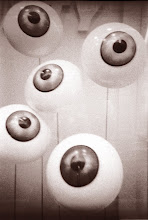
It's been a while since I posted any of my own work but here is the latest record sleeve I've been working on. It is the next release from Manchester's Front & Follow label by Washington based artists BLK wBEAR who have reinterpreted a selection of tracks from Yonokierio's album Blue Apples.
The sleeve illustration is a photo of a selection of ceramic sculptures created by Robin VanValkenburgh under the pseudonym of Runny Bunny. With such a striking image I wanted to make the most of the groups name so I started playing about with the symmetry of the words BLK and BEAR and bent some Helvetica Light into shape to create the typeface. It felt a shame to just stick it in the corner so I decided to place it full size over the image.


Friday, 15 July 2011

Friday, 8 July 2011

Monday, 4 July 2011
Bjork Crystaline

If that wasn't enough the Icelandic songstress has also invented a new instrument called the Gameleste which features in her show Biophilia which is currently at the Manchester International Festival, (as is Damon Albarn's Opera Dr Dee), anyway here is a video of the Gameleste being made.
The Gameleste - a custom instrument for Björk from Andy McCreeth on Vimeo.
Gummy Lips

Anyone know who the design is by?

 |
| Nice use of Futura Black Plain for the text |
Fun and Games


T'is the season of le vide grenier and this year our star finds have been a cool selection of vintage kids games, most of which were produced by a French company called Fernand Nathan who also published beautifully illustrated kids books too. Most of these were picked up for a few Euros which is great for such a nice collection of Illustrations.While I was doing some research on the company I came across this nice flickr stream of other Fernand Nathan bits and bobs!


Friday, 1 July 2011

Wednesday, 29 June 2011
Richard Hawley's family tree

Tuesday, 28 June 2011
The Earl Bishop

As a bit of a design challenge I decide to re-design the cover. I didn't have a design brief but as a rule I used all the elements that were on the existing cover and a turn around time of one day. The original cover looks like this, an uncharacteristic sunny day with a blue sky showing off the famous follie with a pillared wall echoing the monuments classic architecture which acts as a holding area for the books title and the authors name.


For the text I used Gill sans in caps for the titles and Perpetua Regular for the quotes and book blurb. I liked the balance between these two typefaces, the geometry of Gill sat well with the frame work while Perpetua Regular gave a classic book feel. One of the only deviations I made from my original brief was that I didn't use an actual portrait of the Bishop instead to fit with the graphic nature of the frame I decide to use a silhouette of the Bishop. The silhouette originated in the 18th century, so it felt apt that it could be included. While I was researching this I found out an interesting little fact about where the word silhouette comes from, if your interested click here!
Anyway the final cover back and front turned out like this:

Friday, 24 June 2011

Friday, 17 June 2011
Nobrow niceness

The print comes from an exhibition called Murmuring Landscapes and is simply one of the nicest pieces of print that I own!


 |
| A selection of spreads from The New Ghost © Robert Hunter |


Thursday, 16 June 2011
Music Matters
I just came across this series of animated videos that were specially commissioned by EMI to illustrate why music matters. I know growing up in Northern Ireland in the 1980's music really did matter to me, it was bith a means of escape and a point of contact. If you want to watch some more on Dylan, Bernard Butler or The Jam then pop over to here.
In the meantime I'm off to put "Piece of Mind" on again, it's been a while and that Tom Judd video took me back to being 14 again, now where did I put my air guitar?!
Wednesday, 15 June 2011
Gill's brother

Macdonald Gill was well known and respected in his day and was reputed for his highly detailed pictorial maps which all have a strong sense of Englishness about them which reflect their time and, like his brothers work, a certain sense of national identity, just look at the map above which places Great Britain at the heart of the world, it reminds me of medieval maps of the known world which did exactly the same thing with Jerusalem!

 |
| Detail from the Wonderground Map of Londontown |
What looks like a highlight of the exhibition will be Macdonald Gills' Wonderground Map of Londontown. This was printed in 1914 for Westminster Press and shows an intricate and beautiful look at London and its Underground stations. The illustration style, colours and lettering evoke an almost Arts and Crafts take on London. The original was printed as 16 sheets (roughly A4) and sold in it's thousands for six shillings, I hope they do a modern reprint as I don't think I could track down never mind buy an original!

To continue the Gill trip then pop into The British Museum to see Eric Gill; Public and Private Art. This exhibition looks at pieces of art created by Gill for Public commissions and for his own private pleasure. As the museum says itself 'The exhibition features work by Gill intended for both public use and private delight, including stamp designs for the Post Office, coin designs for the Royal Mint, drawings for the Stations of the Cross, and his own engravings and publications on religion, politics and art. The centrepiece of the display is his famous sculpture Divine Lovers, on loan from Ditchling Museum in East Sussex. The display also examines Gill’s work on the British Museum building itself, including the war memorial at the main entrance.' The exhibition runs until 9 August and is FREE!
 | ||||||||||||||||||||||||
| Images from top: Self-portrait medal depicting Eric Gill. Engraved by George Friend, about 1933. © reserved. Proof for a one shilling coin by Eric Gill, 1925.© The Royal Mint. Air Raid Precaution Badge, Eric Gill, 1939.© The Trustees of the British Museum. |
And just for good measure here's a reminder of Gills most famous creation Gill Sans, originally created for a book shop in Bristol and then developed as a full typeface for LNER rail travel posters.

Friday, 10 June 2011
1000 Paper Cranes-Last day to donate

They will also be aware that she has passed her original target and has (to date) folded 1408 paper cranes.
Well today is the last day of Mihos paper crane challenge and it is the last day that you can donate to her fund so please, please, please take a little time out and donate what you can to a great effort for a great cause.
You can find her donation page here , and as a well known supermarket chain like to remind us "every little helps!"
Subscribe to:
Posts (Atom)